

THE PROBLEM:
Highly specific and complex use cases have contributed to cluttered web design prioritizing function over features as well as aversion by the general public.
THE SOLUTION:
Creating a coherent and structured hierarchy as well as a refreshed, contemporary design will allow smoother navigation and perhaps a better understanding of what the FCC does among the general public.
MY ROLE: UI designer, UX Researcher
TOOLS: Adobe XD, Affinity Photo, Figma, Invision App, Miro, Giphy Capture

What does the FCC do?
“The Federal Communications Commission regulates interstate and international communications by radio, television, wire, satellite, and cable in all 50 states, the District of Columbia and U.S. territories.”
USER RESEARCH
There are varying use cases for the FCC Website among various users. The majority of the site, however, assumes the user is familiar with the logistics and legalities of issues pertaining to communications in the United States. As such, I focused my research efforts on the use cases of experts.
Proto Persona:

I began by creating a proto-persona that would guide my design decisions moving forward. I assumed my proto-persona would have been visiting the site regularly and frequently for job purposes. As most of the action items on the homepage dealt with proceedings and legal work, I made my proto-persona was a legal council. As such, his main goal would be to keep up to date on rules and regulations issued by the FCC and be able to file necessary documents.
I assumed my persona, Sam, would have been working in this industry for quite some time so I decided to age him up. I also made him partially color blind with fading vision to remain conscious of how the FCC website addresses accessibility issues. A potential issue someone at Sam’s age might experience is transitioning to newer modalities such as a smart phone.
Interface & Navigation Analysis:
While the site was usable, it contained a number of glaring issues that made for an overwhelming and cluttered experience.

Design Issues
- General inconsistencies in format gives user a cluttered feeling
- No clear hierarchy or priority in navigation
- Several assets are not properly aligned adding to the overwhelming experience
User Test Feedback:
“I wasn’t expecting much since it’s a government site”
“If I sit with it for a while I might be able to get [the navigation] down”
“It’s pretty intuitive where everything is, just a bit overwhelming”
““This site isn’t very User friendly [...] it’s probably made for someone like an attorney””
Link to Complete Testing Plan & Notes
User test feedback likewise pointed to a cluttered and overwhelming feeling. Which set me in my wireframing stages.
CARD SORTING & SITEMAP:

Card Sorting
Overall, categories remained relatively the same; however, consolidation of content was necessary to help mitigate an overwhelming experience

Sitemap
With the consolidated categories, the secondary navigation became condensed and would make for a less cluttered experience.
NAVIGATION REDESIGN:
I created a navigation bar that unfolds in a sequential organization scheme to help users keep track of where they are.

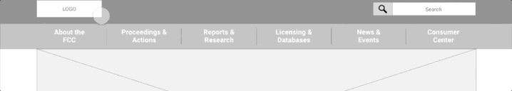

Homepage Lo-Fi Wireframe
- Reorganized the placement of content so user is given a sense of hierarchy
- Maintained links to important systems that are likely to fall within Sam’s use cases
- Structured page such that users are not overwhelmed with the number of options and increased spacing between sections so user has room to breathe
- Fixed broad level alignment issues
STYLE GUIDE:
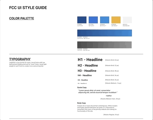
Guidelines
Overall, the UI style should feel contemporary. While modern and highly stylized elements are great, it is important to remember that users of the primary website are looking for functionality of the site.
Color palette remains relatively the same; however, incorporating the yellow as a highlighting indication
Changed font to Roboto in order to prioritize legibility

Hi-Fi MOCK-UP
After creating a style guide, I applied the design styles to my lo-fi wireframe to create a high fidelity mock-up.
I then proceeded to conduct user tests.
5-Second User Tests
Conducted five user tests to gage users’ initial reaction to the new design.
Feedback:

“It’s pretty straight forward”
“The header was confusing, I thought ‘About the FCC’ was going to take me to a page”
“It was a little hard to see the secondary Nav cause it’s all blue”
Iteration:
1. Added arrows and micro-interactions to the hover and active states of navigation sliders to establish them as drawers
2. To create more contrast, the background of the secondary navigation buttons was changed to a grayscale gradient.

RESPONSIVE WEB-DESIGN
As the site includes highly complex forms and the action items would likely be more conducive to a desktop modality, use cases for the FCC site would likely be limited to checking status updates on proceedings or news & events.
Mobile Wireframes:
In order to avoid an overwhelming experience, the Quick Links and Filing links are prioritized
As mobile use cases are more likely for “checking” purposes, user would most likely be able to work within the Quick Links or Filing links
Primary navigation was condensed into hamburger menu to avoid clutter

Hi-fi Mockup

A/B TESTING:

Results:

Pinning the search bar feels cluttered
Slight leaning towards putting “Quick Links” before Submit Filing
The hamburger menu was too small.

