THE PROBLEM:
With outdated and hard-to find information as well as an unwelcoming design, the warm atmosphere of LIFE Church was not properly conveyed which deterred potential visitors.
THE SOLUTION:
Establish a hierarchy of information with up-to-date content as well as refresh the layout to represent the personality of LIFE Church to visitors.
DURATION: 2 weeks
MY ROLE: UX Researcher, UX Designer, Coding Engineer
TOOLS: Miro, Figma, Google Suite, Github, Visual Code Studio
Who is LIFE Church of West LA?
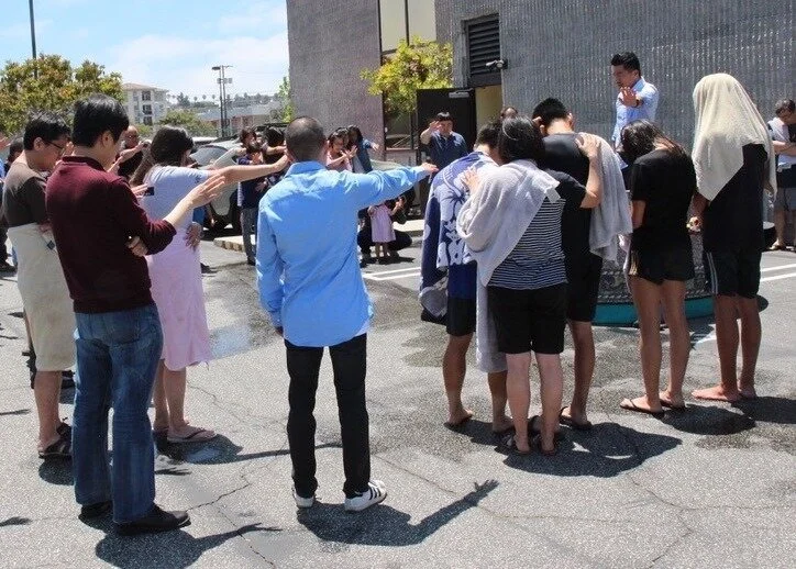
Baptism service at LIFE Church.
LIFE Church was a small church located near the edge of Culver City, CA with a congregation of about 30 members. The congregation was dedicated to serving and sharing with the greater Los Angeles area through individual initiatives or partnerships with other churches.
Members of LIFE Church agreed that the small congregation made for a family feel with a warm atmosphere. The congregation also spent a lot of time together outside of Sunday services.
USER RESEARCH:
To begin this project, I decided to research the main motivations for attending a church and what people look for in churches. Seeking a church is a highly personal journey and therefore a "one size fits all" approach does not exist. Through a combination of survey data, user interviews, and ancillary research; we were able to pull some useful insights.
Survey data:
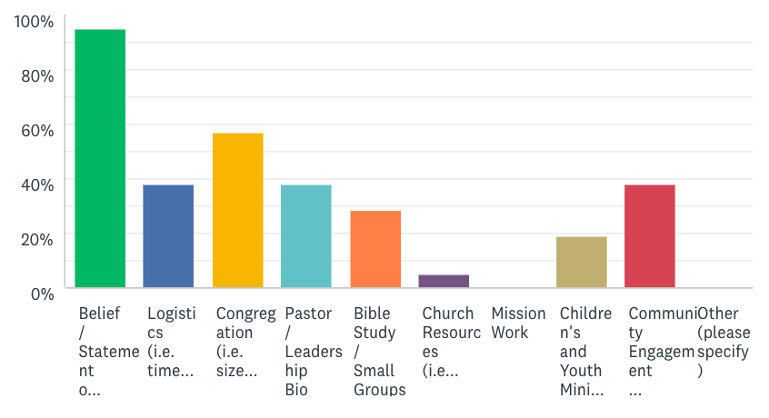
Research began by deploying an initial survey to understand how people who identify as Christian would approach a search for a new home church. From a pool of 20 respondents, beliefs and statement of faith was almost unanimously agreed to be the main factor. Congregation size and demographics came as the next most considered factor with nearly half of all respondents. Factors such as resources, bible studies, or mission work interestingly did not index as high.
User Interviews:
For qualitative data, I conducted four user interviews. I felt it was important to get perspective from both those who identify as Christian as well as those who do not and so chose two interviewees who did not identify as Christian. Although I expected different criteria from these groups, there was consensus on what was desired when attending church.
“Making sure the doctrine is biblical plays an important part in my decision. Need to make sure [the church] is intentional with its beliefs”
“I like to know who I’m going to be rubbing elbows with before I attend. Having a good sense of what the people are like and who the Pastor would have a big impact on my decision [to visit]”
Ancillary Research:
February Evangelical Leaders Survey
According to a 2015 article from the National Association of Evangelicals, Americans prioritize friendliness over resources and services that a church may provide. This finding was consistent with responses from our user interviews.
Research Insights:
From our research we came to understand:
For someone who identifies as Christian, a church must have a sound statement of faith. If the doctrine and beliefs are not biblical, this is likely to raise a red flag.
Even if a church has great resources and sermons, a visitor is not likely to come again if they do not feel welcomed or feel they do not fit in with the congregation culture.
USER PERSONA:
With this research, we proceeded to create a user persona. Our persona, Robert, is moving across country to LA and needs to find a new home church. He's already familiar with some of the larger churches in LA, but he's looking for a smaller congregation so he can build meaningful relationships and service the local community. Robert also has a 6-year-old daughter so he wants to find a church with a good children's program.
HEURISTIC ANALYSIS:
If Robert were to find the LIFE Church website, he would likely encounter a number of issues while navigating.
While a Sunday service logistics and a brief description of the church are present, there isn't really a sense of information hierarchy.
The site is very text heavy and lacks of imagery
In order to explore other offerings from the church (i.e. resources, small groups, etc.) the user must go deeper into the site using the nav bar.
The COVID-19 response is at the bottom of the page, so Robert might not even find the notice it.
Robert would not get the family-vibe of the congregation. This site would not fulfil the criteria of 'friendliness' noted in user research. After completing the heuristic analysis we identified two main issues to solve.
Establish a sense of information hierarchy
Redesign the aesthetics of the site to convey a more welcoming and authentic feel for the church
PAPER SKETCHING:
Working with my partner, we began sketching a new layout for the LIFE church site landing page. We agreed the landing page should have easy access to information regarding sunday service logistics, but also information on the church, the pastor, and the small groups. We also decided to make the experience scroll based so that the user could take in more information without navigating too deep within the site.
LO-FI HOMEPAGE WIREFRAME:
After taking components from both of our sketches, we moved into our lo-fi wireframe. When prioritizing information, we figured the user would want to know what this church looks like so we placed a jumbotron that would have an image of the congregation. The user would want to know more about this church and so we placed a short description of the church as well as a bio of the pastor.
After gaining a sense of this church, perhaps the user would be more curious about ways they could get involved in the church so we included a section where users could read about the different groups and access those pages if they wanted to learn more. We placed the Sunday service information at the bottom as the user would ideally have made a decision to visit by the time they reached the bottom of the page. If they had questions we put in a question form as well.
MID-FIDELITY:
After having successful user tests with our lo-fi wireframe, we moved into applying UI elements.
Using the existing color pallet of the site, we began applying colored backgrounds taking inspiration from Design 3.0 layouts we had seen during research. When we tested this version, however, we quickly realized we had been making UI choices without intent. The green backgrounds were taking away from the content and were mostly there for pure aesthetic purposes. After realizing this, we decided to take a step back and go for a simpler layout.
CODED SITE:
After falling back to our simpler layout, we felt we were in a good place to build the site in code. Using Bootstrap components, I was able to quickly assemble the landing page as well as the a few secondary pages.
USER TESTING:
Feedback:
“This site feels very organized and it’s easy to navigate, but it’s not very welcoming”
“For a church called LIFE Church, this site doesn’t feel very ‘lively’”
Ultimately, we realized that while we had solved the issue of finding information, the site still did not give a welcoming vibe to users. We decided to take another step back and review how we might solve the issue. So, we went back into prototyping with Figma to come up with a new layout.
ITERATION:
In order to make the site more 'lively' we added backgrounds and varied the color a bit more. We also tried to represent aspects of the page in a more visual manner.
CONCLUSION:
In the end, we learned that it's sometimes better to take a step back and take a simpler approach. While we were not able to plan out the full site in the two week duration of this project, we would like to continue working on the site and pitch our ideas to LIFE Church.


